Representative MoA Data: What Thermal Proteomics Results Look Like
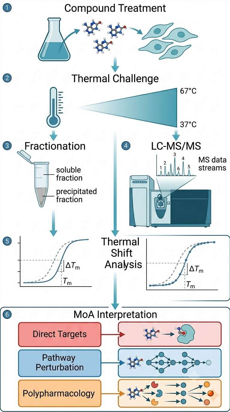
Thermal proteomics generates rich, multi-dimensional data. Below are the key result types you can expect from a typical MoA study.
Melting Curve Shifts
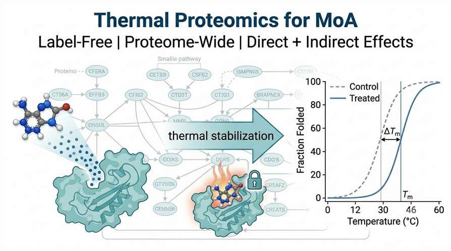
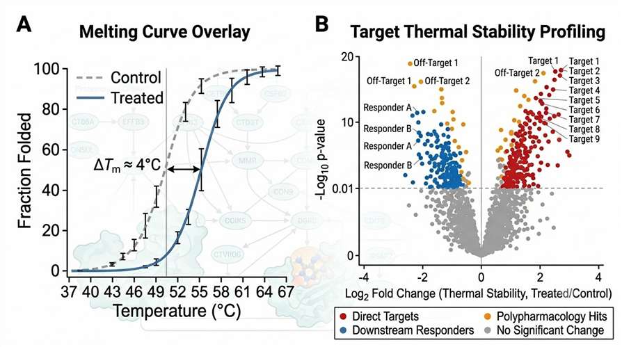
The primary data output is a set of melting curves comparing treated and control samples. For each quantified protein, we generate a sigmoidal melting curve with calculated Tm values. Direct targets show clear Tm shifts (typically 2–8°C), while downstream responders show smaller but reproducible shifts.
Proteome-Wide Thermal Shift Volcano Plot
The volcano plot visualizes the entire proteome's response to compound treatment. Each point represents a protein, plotted by its log₂ fold change in thermal stability (X-axis) against statistical significance (Y-axis). Proteins are color-coded by interpretation category: direct targets (red), downstream responders (blue), polypharmacology hits (orange), and no significant change (gray).
Pathway Enrichment from Thermal Hits
Pathway enrichment analysis of all thermally shifted proteins reveals the biological processes affected by compound treatment. This is particularly valuable for distinguishing on-target pharmacology from off-target effects — if the enriched pathways are consistent with the intended mechanism, the compound is acting as expected; if unexpected pathways appear, further investigation is warranted.
Dose-Response Thermal Profiles (2D-TPP)
For 2D-TPP experiments, we generate dose-response curves for each shifted protein, with EC₅₀ values that reflect the potency of target engagement. This allows direct comparison of compound potency across multiple targets and reveals whether off-target engagement occurs at concentrations relevant to the intended pharmacology.