- Service Details
- Demo
- FAQ
- Publications
What is Heatmap?
A heatmap is a graphical representation of data where individual values contained in a matrix are represented as colors. This visualization technique is widely used in various scientific fields, including biology, to represent complex data in a more intuitive and comprehensible manner. The two-dimensional grid structure allows for the depiction of data density, trends, and patterns, making it an invaluable tool for data analysis.
Types of Heatmaps
There are multiple types of heatmaps used across different domains:
- Biology Heatmaps: Commonly used in molecular biology to represent gene expression levels across different samples obtained from DNA microarrays or RNA sequencing (RNA-seq).
- Tree Maps: These are hierarchical and two-dimensional partitioning of data, visually resembling heatmaps.
- Web Heatmaps: Used to display the areas of a webpage most frequently interacted with by visitors.
- Density Function Visualization: Represents the density of points on a map, aiding in understanding the distribution of data points.
- Mosaic Plots: Tiled heatmaps representing two-way or higher-way tables of data, with hierarchical organization similar to tree maps.
Why is Heatmap Analysis Needed?
Data Visualization
Heatmaps provide a visual summary of information, allowing researchers to quickly identify patterns, correlations, and outliers within large datasets. This is particularly useful in fields like genomics, where data complexity can obscure significant insights when presented in raw numerical form.
Comparative Analysis
By visualizing data in a heatmap, one can easily compare different datasets. For example, in molecular biology, heatmaps can compare gene expression levels across multiple conditions or treatments, providing insights into the effects of specific variables.
Identifying Trends
Heatmaps excel at highlighting trends over time or across different conditions. For instance, a heatmap showing precipitation patterns in Seattle over several years can reveal seasonal variations and long-term trends in rainfall.
Enhanced Interpretation
The use of color to represent data values in heatmaps enhances the interpretability of complex data. This visual representation can make it easier for both specialists and non-specialists to understand and analyze the information.
What We Can Provided?
At Creative Proteomics, we harness the power of heatmap analysis to provide detailed and insightful visual representations of complex biological data. Our services span across proteomics, metabolomics, and glycomics, ensuring comprehensive support for researchers in these fields.
Heatmap Analysis in Proteomics
In the realm of proteomics, heatmap analysis is indispensable for visualizing and understanding protein expression levels across different samples and conditions. This visualization technique helps in identifying patterns and correlations that might not be apparent in raw data.
- Protein Expression Profiling: By using heatmaps, researchers can observe variations in protein expression between normal and diseased states, under different treatments, or across various time points. This can be crucial for identifying potential biomarkers and understanding disease mechanisms.
- Protein Interaction Networks: Heatmaps can illustrate the interactions between different proteins, aiding in the construction of protein interaction networks. This can lead to the discovery of new pathways and potential therapeutic targets.
- Post-translational Modifications (PTMs): Our heatmap analysis can also be applied to study PTMs, which are critical for protein function. By visualizing PTM patterns, researchers can gain insights into the regulatory mechanisms controlling protein activity.
Heatmap Analysis in Metabolomics
Heatmaps play a vital role in metabolomics, particularly in visualizing the concentrations of metabolites under various conditions. This can reveal metabolic shifts that occur in response to diseases, treatments, or environmental changes.
- Metabolic Profiling: Heatmaps allow for the comparison of metabolite levels across different samples, helping to identify biomarkers for diseases or the effects of therapeutic interventions.
- Pathway Analysis: By integrating metabolomic data with pathway information, heatmaps can highlight alterations in metabolic pathways. This can provide insights into the biochemical processes affected by different conditions or treatments.
- Temporal Analysis: Heatmaps are effective for visualizing how metabolite levels change over time, offering a dynamic view of metabolic processes and their regulation.
Heatmap Analysis in Glycomics
In glycomics, heatmap analysis is utilized to visualize the distribution and abundance of glycans in various biological samples. This is crucial for understanding the roles of glycans in health and disease.
- Glycan Profiling: Heatmaps can represent the complex glycan structures and their abundances, facilitating the identification of glycosylation patterns that are characteristic of specific diseases or conditions.
- Comparative Analysis: By comparing glycan profiles across different samples or conditions, heatmaps help in identifying changes in glycosylation that could be linked to disease states or therapeutic effects.
- Functional Insights: Heatmaps can correlate glycan data with other biological datasets, such as proteomics or transcriptomics, providing a holistic view of the biological processes involving glycans.
Workflow of Heatmap Analysis
Data Collection: We start by collecting data from your samples using advanced analytical techniques. This step is crucial for ensuring the quality and accuracy of the subsequent analysis.
Data Processing: The raw data is processed to remove any noise and to normalize the values. This step is critical for generating accurate and reliable heatmaps.
Heatmap Generation: Using sophisticated software, we generate heatmaps that visually represent the processed data. These heatmaps are customizable to highlight specific aspects of your data.
Data Interpretation: Our team of scientists helps interpret the heatmaps, providing detailed reports and actionable insights. We ensure that the interpretation is clear and accessible to both specialists and non-specialists.
Consultation and Support: We offer ongoing support and consultation to help you make the most of your heatmap analysis results. Our team is available to answer any questions and to provide additional insights as needed.

Heat map of differential protein clustering

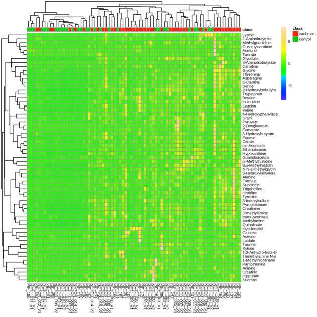
Metabolite heat map clustering results

Pearson correlation heatmap
What are the advantages of using Heatmaps in biological research?
Visual Clarity: They provide a clear and intuitive way to visualize complex data sets, making it easier to identify patterns and relationships.
Data Density: Heatmaps can display large amounts of data in a compact form, which is particularly useful for high-throughput data like gene expression profiles.
Pattern Detection: They help in detecting patterns, trends, and anomalies that might not be apparent in raw data.
Comparative Analysis: Heatmaps facilitate comparison across multiple samples or conditions, which is essential in experiments like differential gene expression analysis.
Integration with Clustering: When combined with hierarchical clustering, heatmaps can reveal clusters of similar data points, aiding in the identification of co-regulated genes or similar samples.
Quantitative Insights: They allow for quantitative interpretation through color gradients, enabling researchers to quickly assess the magnitude of changes or differences.
Customization: Heatmaps can be customized with different color palettes and binning strategies to suit specific research needs and improve interpretability.
What are the common issues encountered in Heatmap analysis?
Overplotting: When data points are densely packed, it can lead to overplotting, making it difficult to distinguish individual values.
Color Misinterpretation: Inappropriate color choices can mislead interpretation, especially if the color palette does not represent the data accurately or if it is not colorblind-friendly.
Binning Artifacts: Poor binning choices can introduce artifacts or obscure patterns. Bins that are too large may oversimplify the data, while bins that are too small may exaggerate noise.
Normalization Errors: Failing to properly normalize data can result in misleading visualizations, especially when comparing data sets with different scales.
Missing Data: Handling missing data improperly can skew the heatmap. It’s crucial to address missing values through imputation or other methods before generating the heatmap.
Legend Omission: Omitting a color legend can make it impossible for viewers to interpret the heatmap correctly.
Technical Limitations: Some software tools may have limitations in handling very large data sets or in providing sufficient customization options.
How to choose the appropriate color palette for a Heatmap?
Choosing the appropriate color palette is crucial for effective heatmap visualization:
Sequential Palettes: Use sequential color palettes when data values have a natural order, typically with lighter colors representing lower values and darker colors representing higher values.
Diverging Palettes: Use diverging palettes for data with a meaningful midpoint or zero point. These palettes have two contrasting colors at the ends with a neutral color in the middle.
Perceptual Uniformity: Choose palettes that are perceptually uniform, meaning the color differences correspond to equal value differences.
Colorblind-Friendly: Ensure the color palette is colorblind-friendly to make the heatmap accessible to a wider audience.
Context-Appropriate: Consider the context of the data. For example, in biological research, green-to-red palettes are commonly used to represent upregulation and downregulation in gene expression.
Testing and Validation: Test different palettes to see which one best represents the data and highlights the patterns you want to emphasize. Validate your choice by seeking feedback from colleagues or using visualization best practices.
How to address overplotting in Heatmap analysis?
- Binning Adjustment: Adjust the size of the bins. Larger bins can reduce the density of data points per bin, making the heatmap more readable.
- Transparency: Apply transparency to the cells to allow overlapping points to be visible.
- Sampling: Use a representative subset of the data to reduce the number of points plotted.
- Color Saturation: Limit the saturation of the color palette to ensure that overlapping points do not result in overly dark or indistinguishable areas.
- Aggregation: Aggregate data points within bins to provide a summary statistic (e.g., mean, median) rather than individual data points.
- Alternative Visualizations: Consider using alternative visualization methods, such as 2D density plots or contour plots, if overplotting remains a significant issue.
What are the best practices for data binning in Heatmap analysis?
Context Consideration: Choose bin sizes that are appropriate for the context of the data and the research question. Ensure bins are not too large to miss important details or too small to introduce noise.
Consistency: Maintain consistent bin sizes across the heatmap to avoid misinterpretation.
Dynamic Binning: Use dynamic binning techniques, such as equal-frequency binning, to ensure that each bin contains a similar number of data points.
Sensitivity Analysis: Perform sensitivity analysis by varying bin sizes to see how they affect the heatmap and choose the most informative bin size.
Statistical Justification: Base binning decisions on statistical properties of the data, such as the distribution and range of values.
Documentation: Clearly document the binning strategy used to ensure reproducibility and transparency in the analysis.
How to include and interpret a legend in a Heatmap?
- Legend Inclusion: Always include a legend that explains how colors map to data values. The legend should be placed in a visible and easy-to-understand location.
- Color Gradient: The legend should display the color gradient used in the heatmap, showing the range of values each color represents.
- Value Labels: Include numeric labels on the legend to indicate the specific data values corresponding to different colors.
- Interpretation: Use the legend to interpret the heatmap by matching colors in the heatmap to the values on the legend. This helps in understanding the magnitude and distribution of the data values.
- Contextual Information: Provide additional contextual information if necessary, such as explaining any thresholds or critical values that are highlighted by specific colors.
How to ensure accuracy in Heatmap data visualization?
- Data Integrity: Start with accurate and high-quality data. Clean and preprocess the data to remove errors and inconsistencies.
- Normalization: Normalize the data to ensure that differences in scales or units do not distort the visualization.
- Appropriate Binning: Choose appropriate bin sizes to accurately represent the data without introducing artifacts.
- Color Mapping: Select a color palette that accurately represents the data values and is easy to interpret.
- Legend Inclusion: Include a clear and informative legend to help interpret the colors.
- Validation: Validate the heatmap by cross-referencing with other analysis methods or statistical tests to ensure that the visual patterns correspond to actual data trends.
- Transparency: Document the data processing and visualization steps to ensure transparency and reproducibility.
Metabolomic changes associated with acquired resistance to Ixodes scapularis
Yingjun Cui, Jaqueline Matias, Xiaotian Tang, Balasubramanian Cibichakravarthy, Kathleen DePonte, Ming-Jie Wu, Erol Fikrig
Journal: Ticks and Tick-borne Diseases
Year: 2024
https://doi.org/10.1016/j.ttbdis.2023.102279
Transcriptomics, metabolomics and lipidomics of chronically injured alveolar epithelial cells reveals similar features of IPF lung epithelium
Willy Roque, Karina Cuevas-Mora, Dominic Sales, Wei Vivian Li, Ivan O. Rosas, Freddy Romero
Journal: bioRxiv
Year: 2020
https://doi.org/10.1101/2020.05.08.084459